Boni
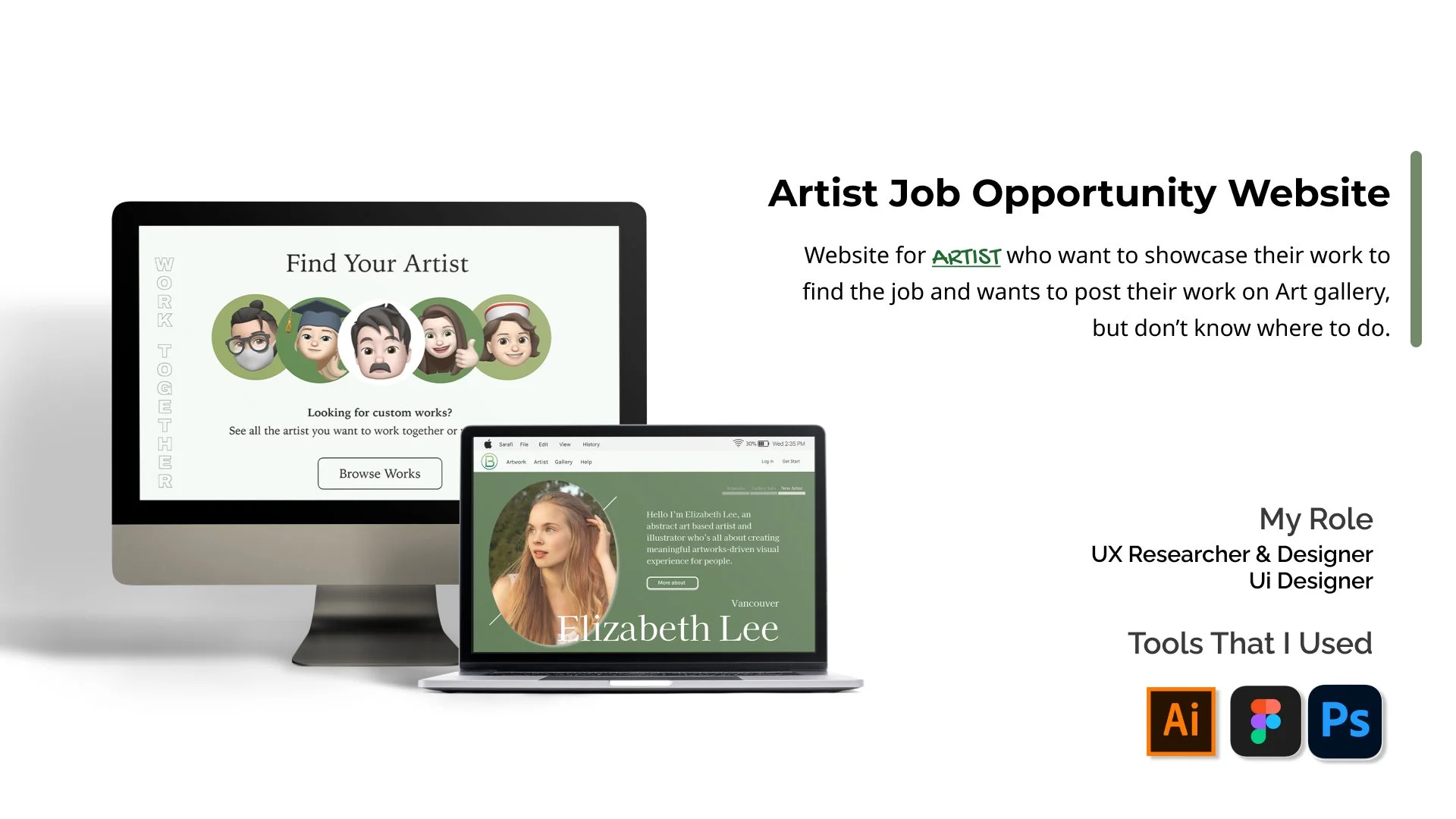
Artist Job Opportunity Website
Boni
🎨
Boni 🎨


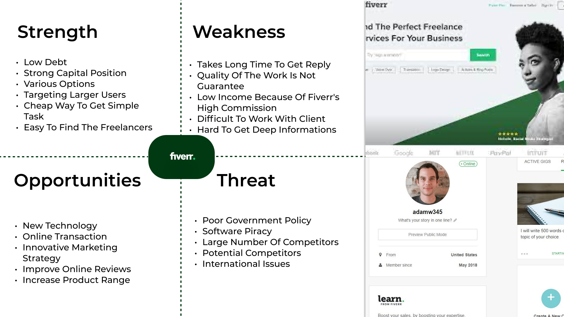
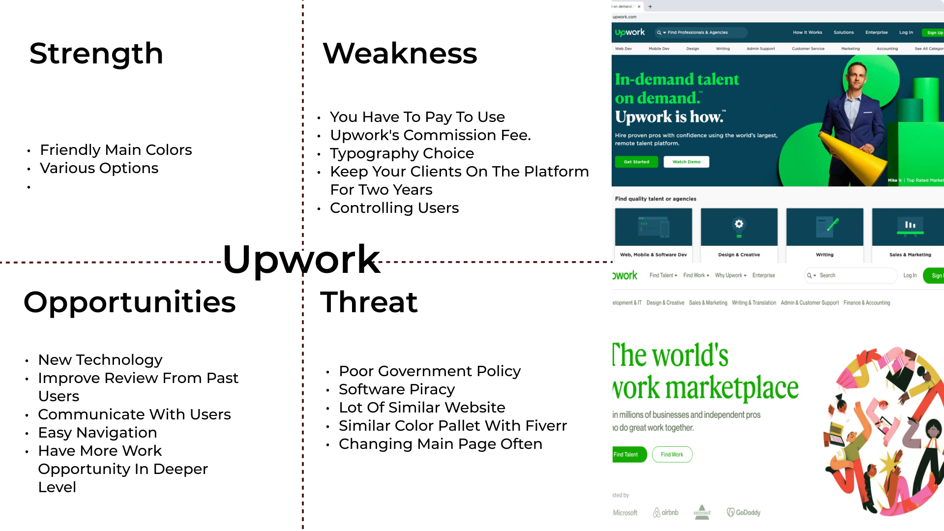
Competitive Analysis


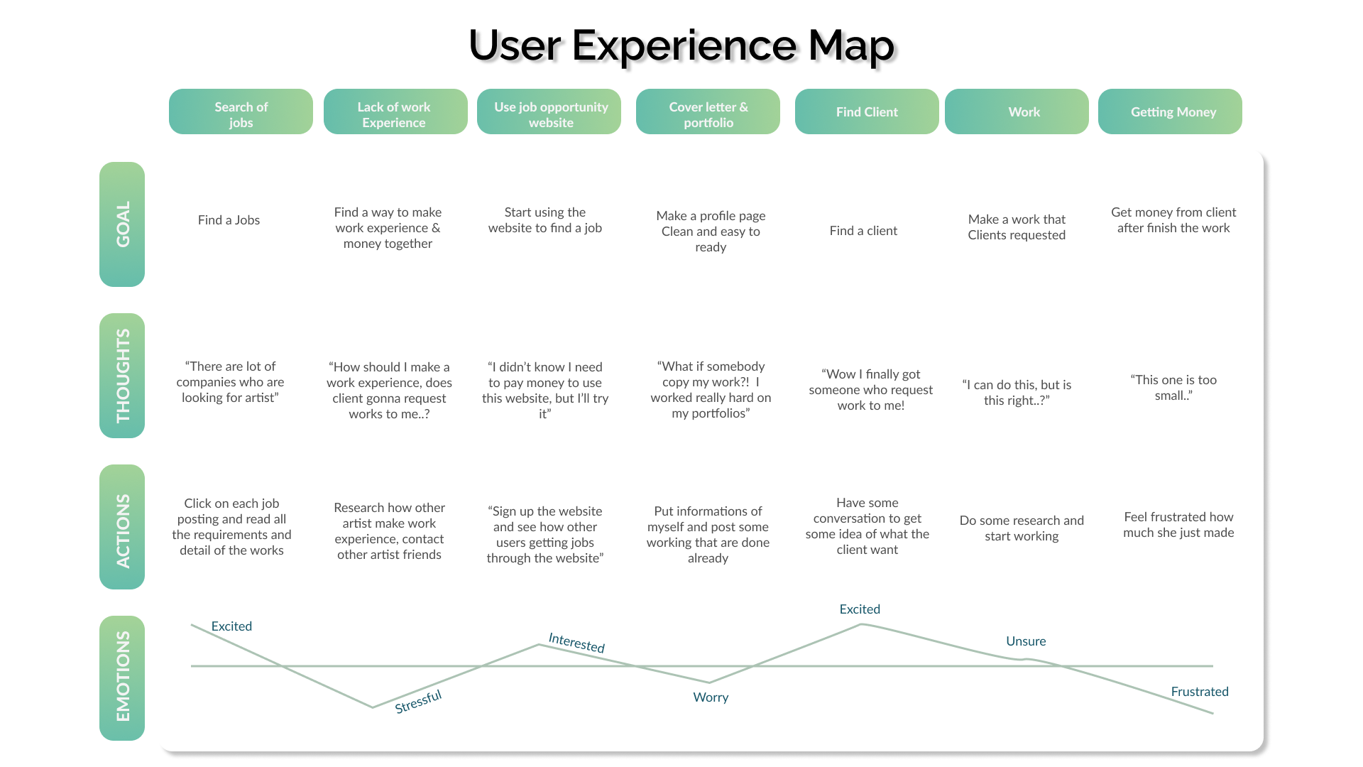

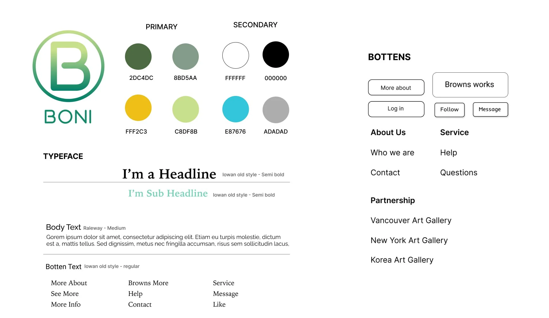
Style Tile


“The current logo design does not align well with the established brand color palette, which results in a visual disconnect between the logo and the overall brand identity. Additionally, the overall tone of the logo conveys a very relaxed and casual vibe, which may not effectively represent the brand’s intended personality or values. I recommend revisiting the color choices to ensure consistency with the brand guidelines and adjusting the design elements to better reflect the brand’s core messaging and desired audience perception.”
“I really appreciate your concept, and I believe this website has great potential and value. However, I think it’s crucial to establish a stronger visual and textual presence on the main page. A compelling hero image paired with clear, engaging messaging can significantly enhance first impressions and draw visitors in more effectively. Strengthening this aspect will help communicate the site’s purpose more clearly and capture user interest right from the start.”
“The overall mood and purpose of the website are not immediately clear, which may lead to confusion for users navigating the site. Additionally, the use of multiple, varied colors throughout the design creates visual clutter and detracts from a cohesive brand experience. To improve clarity and user engagement, I recommend refining the color palette to ensure consistency and aligning the visual tone more closely with the site’s intended purpose and target audience.”


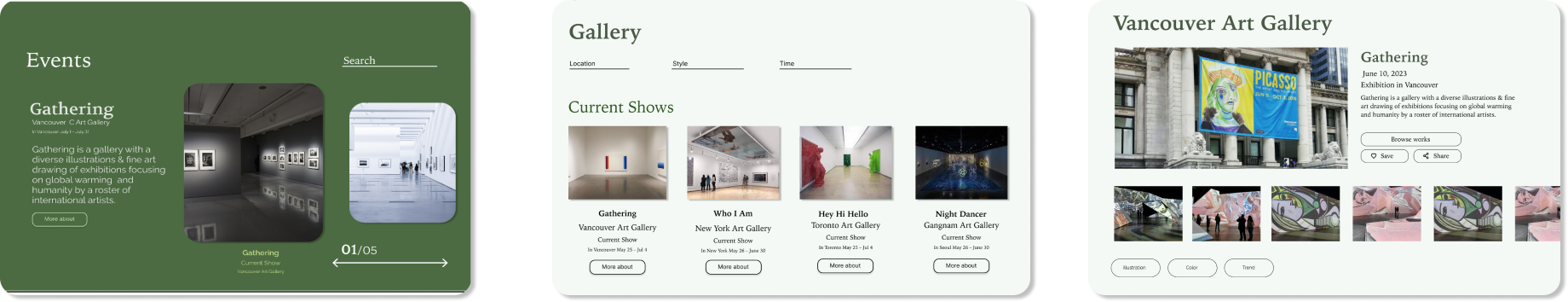

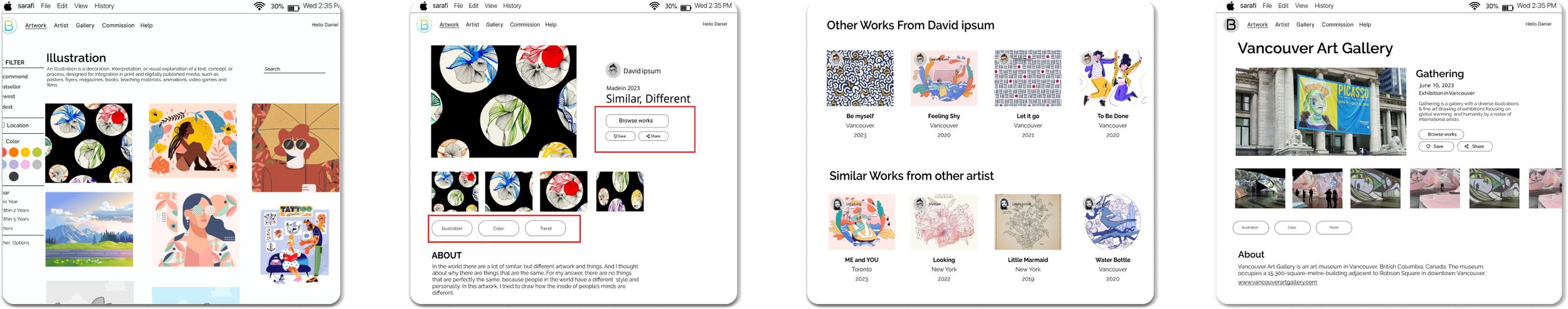
Final Design Summary
After gathering valuable feedback from multiple users during the testing phase, I took the time to carefully reflect on their insights and suggestions. Based on this input, I have finalized the latest version of the website. For this final design, I made significant adjustments to the overall color scheme and visual mood in order to create a more polished and professional aesthetic. The new color palette is more cohesive and aligns better with the brand identity, while the refined tone helps to clearly communicate the website's purpose and value. These changes were made with the goal of enhancing the user experience, improving visual clarity, and presenting a more consistent and engaging design throughout the site.
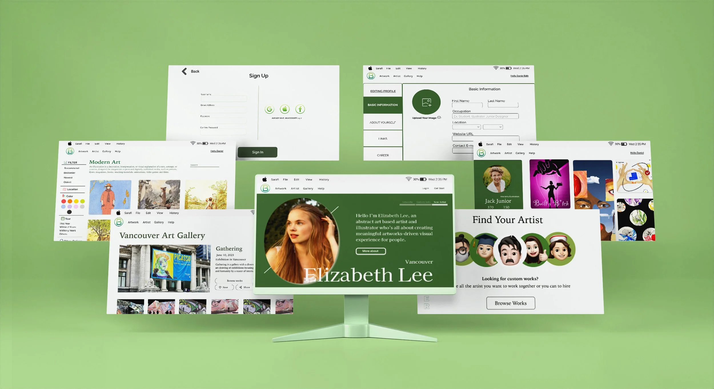
Mock Up